editoral

In this part of my portfolio there are a collection of projects that explore editorial design.
Within my degree I learnt the importance of text layout within graphic design. Learning to balance imagery and text is challenging but is undoudtably important part of being a designer! Here are my favourite projects…
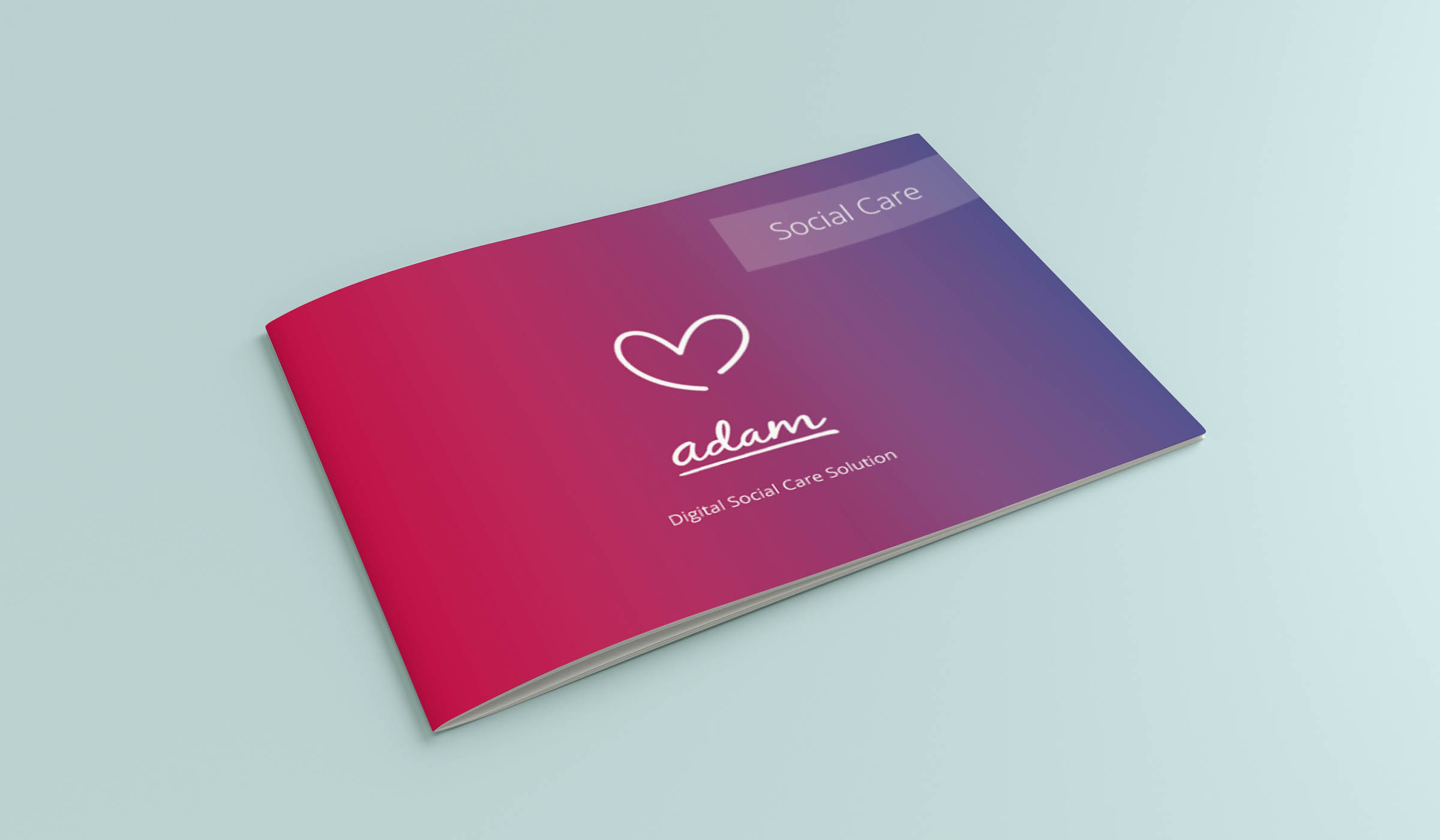
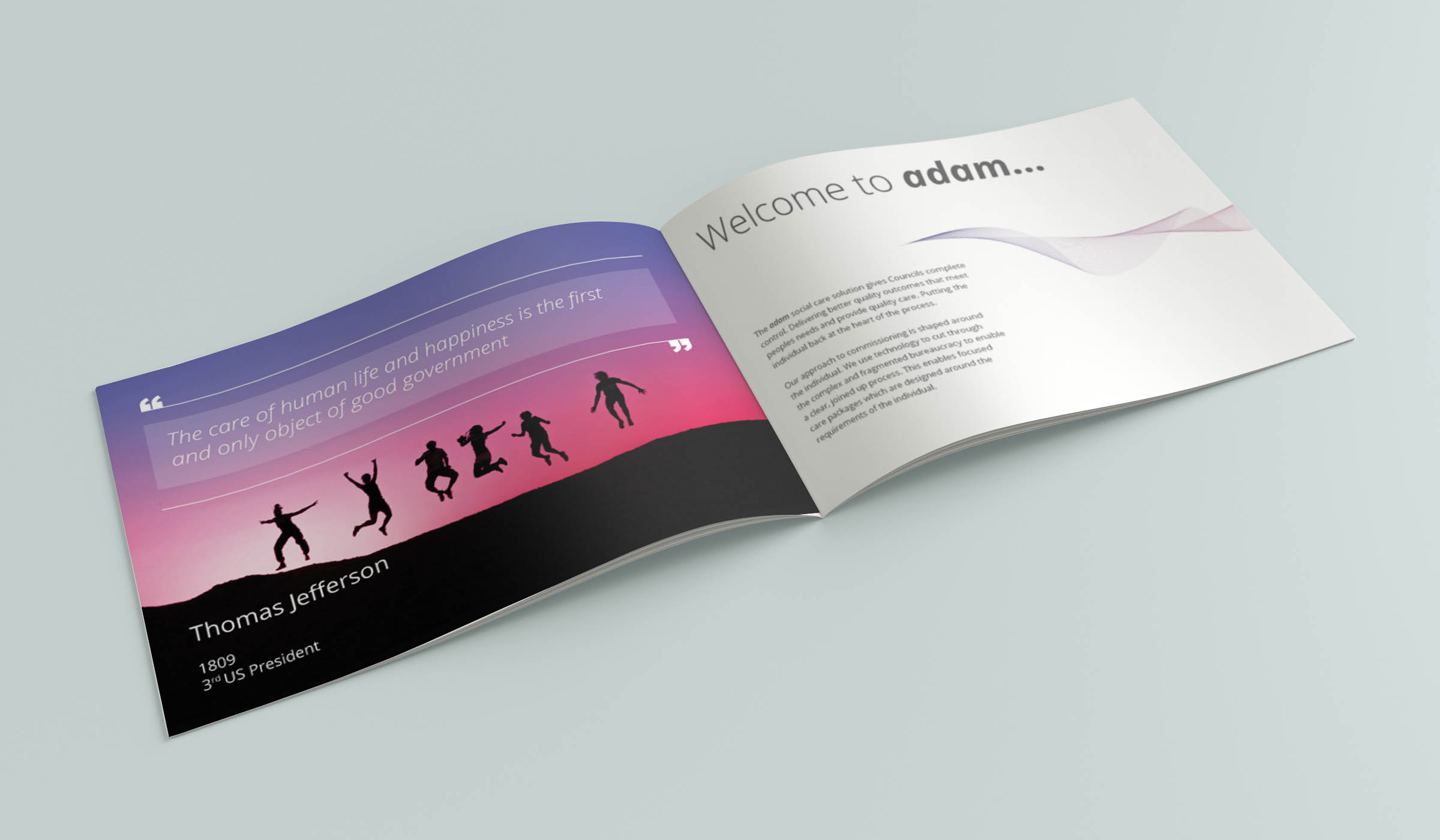
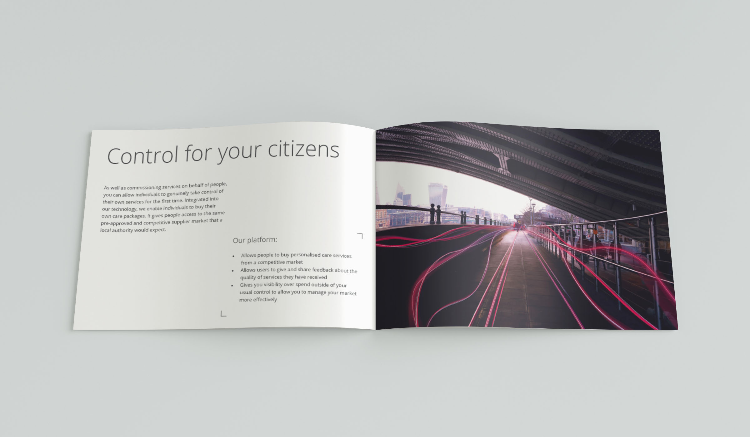
adam HTT
Working as the in-house graphic designer at adam HTT gave me plently of opportunities to work within editoral design. I like to create info graphics within copy that is figure heavy to allow for an engaging and memeorable read.
When working in editorial I enjoy creating my own imagery – I feel this gives strong consistency and orginality to a brand’s identity.
Below, most of the ilustartation and photography running through out the publications are my own work.
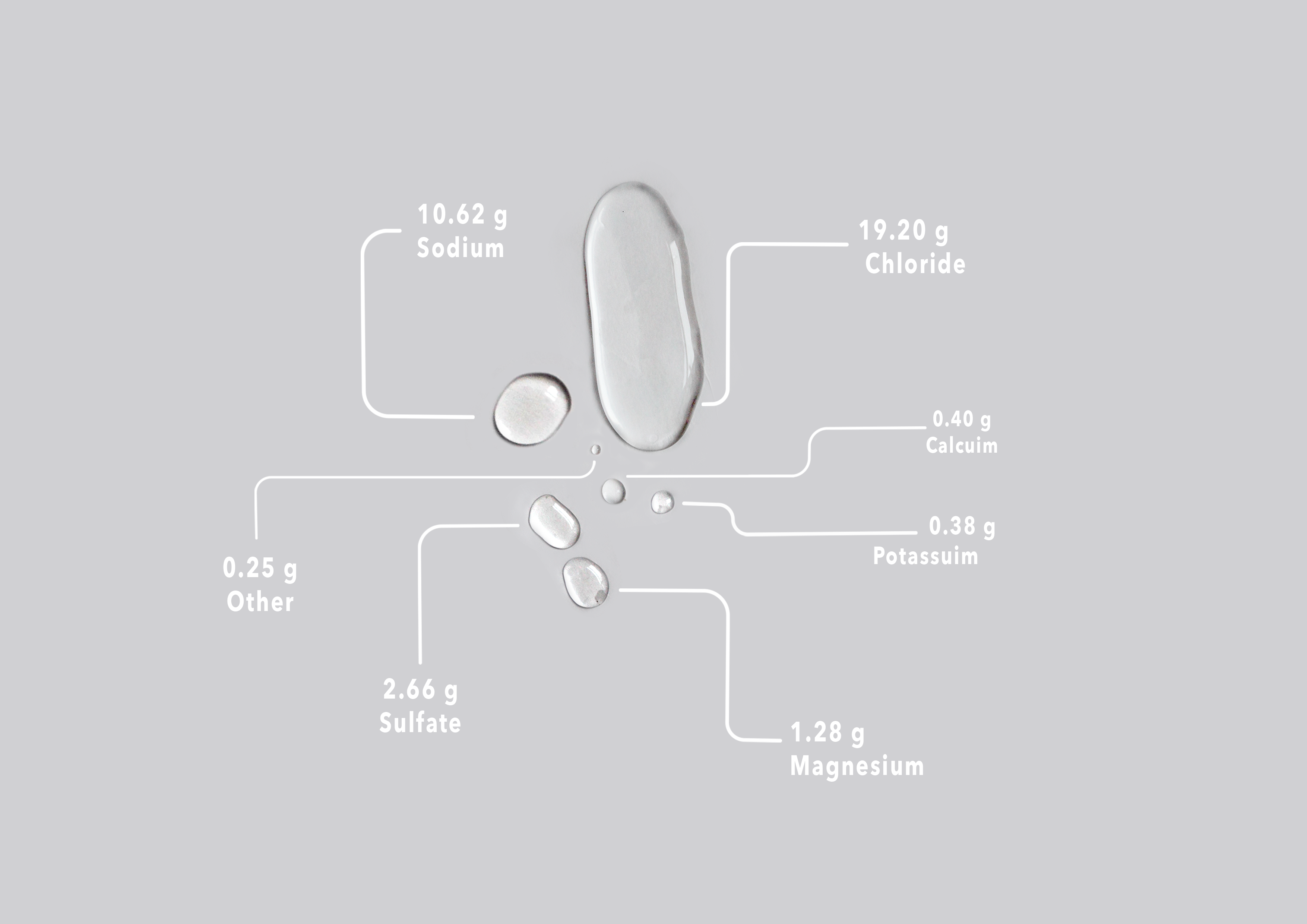
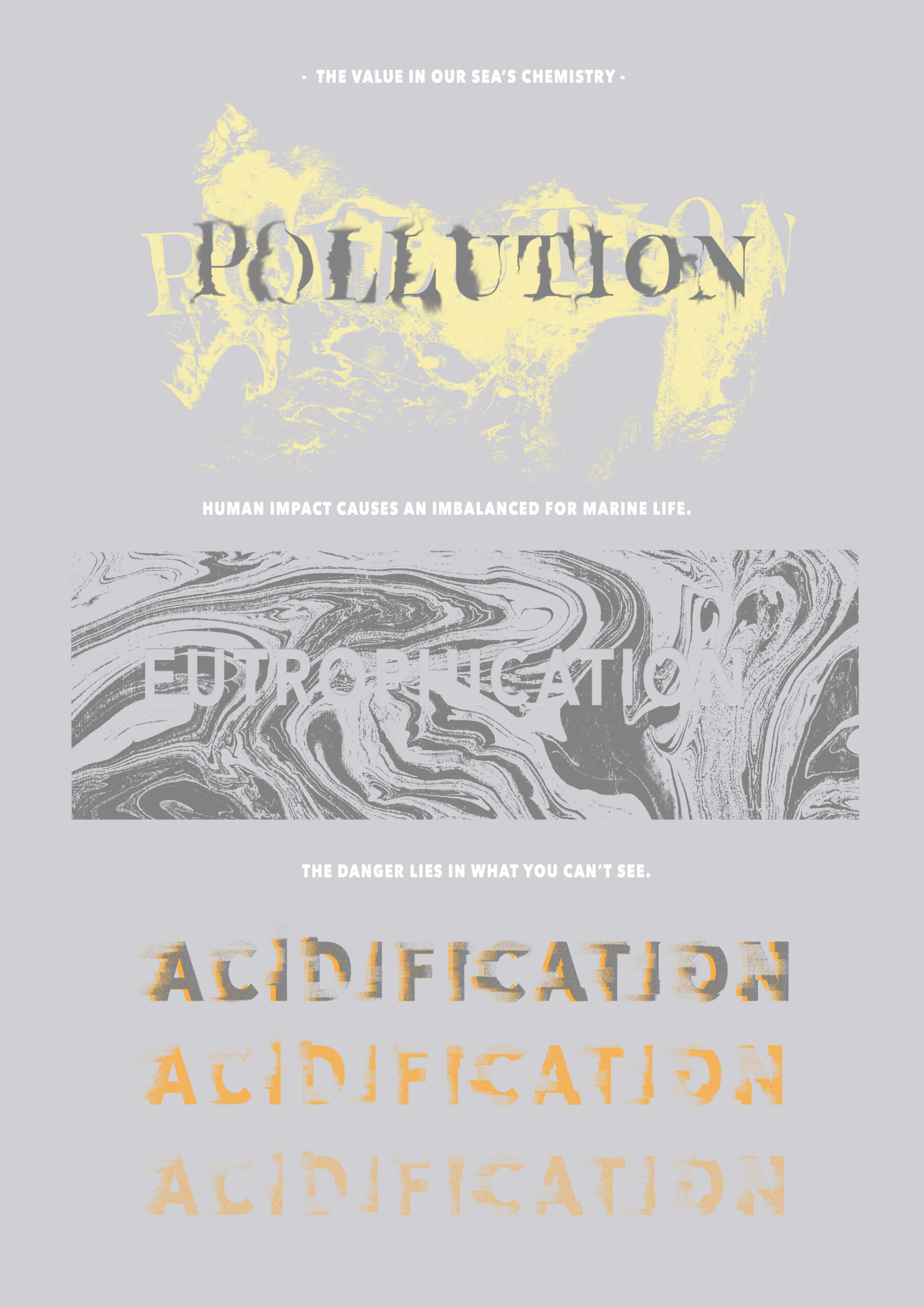
VALUE IN OUR SEAS’ CHEMISTRY
This project was created in response to a brief that was set to raise awareness and understanding of the issues surrounding the sea. Looking into how we see the oceans as a finite resource when the reality is very different.
The booklet I created looks into what happens when a ecosystem’s chemistry is altered due to human activity. Exploring three topics: pollution, acidification and eutrophication.
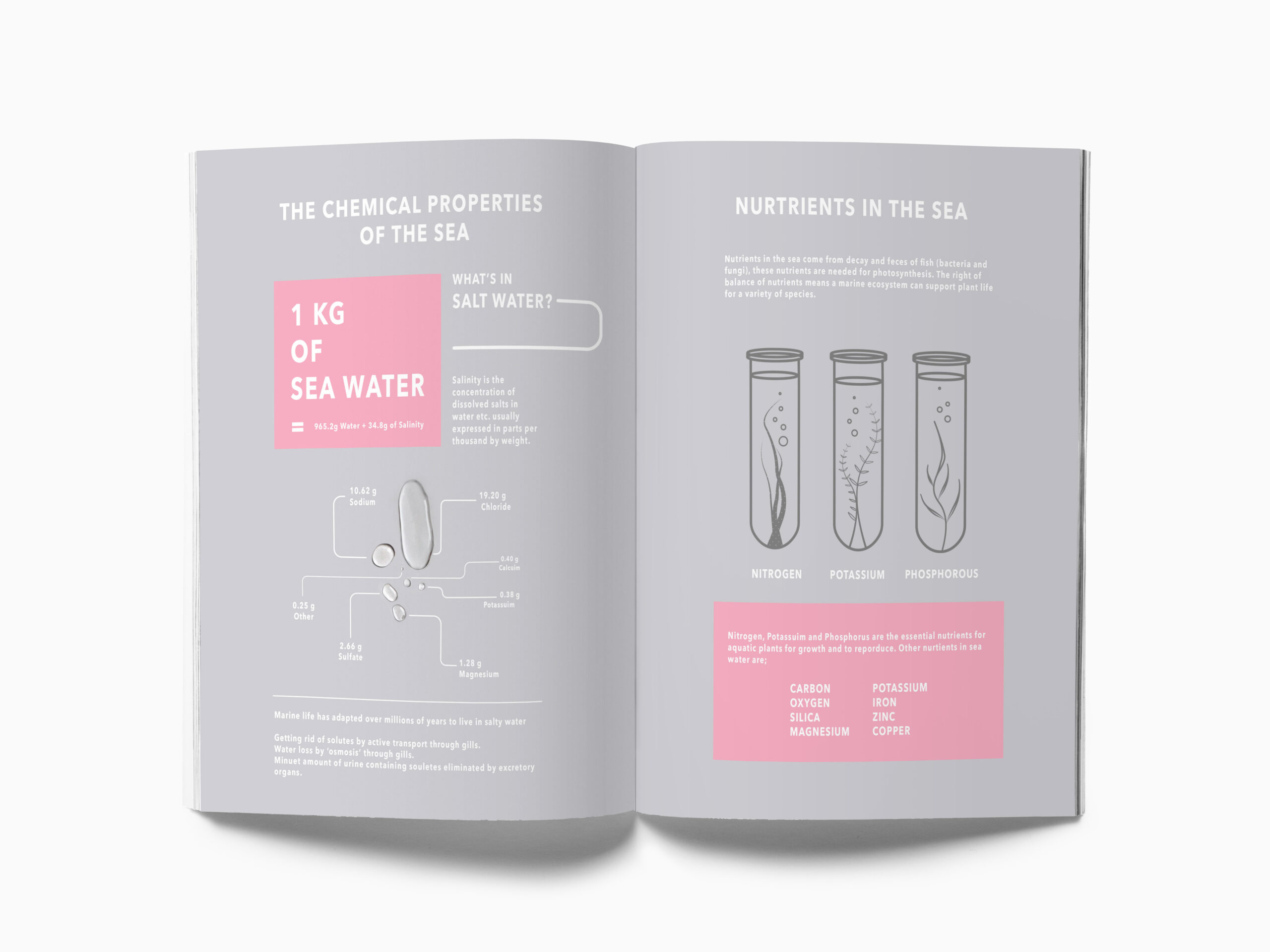
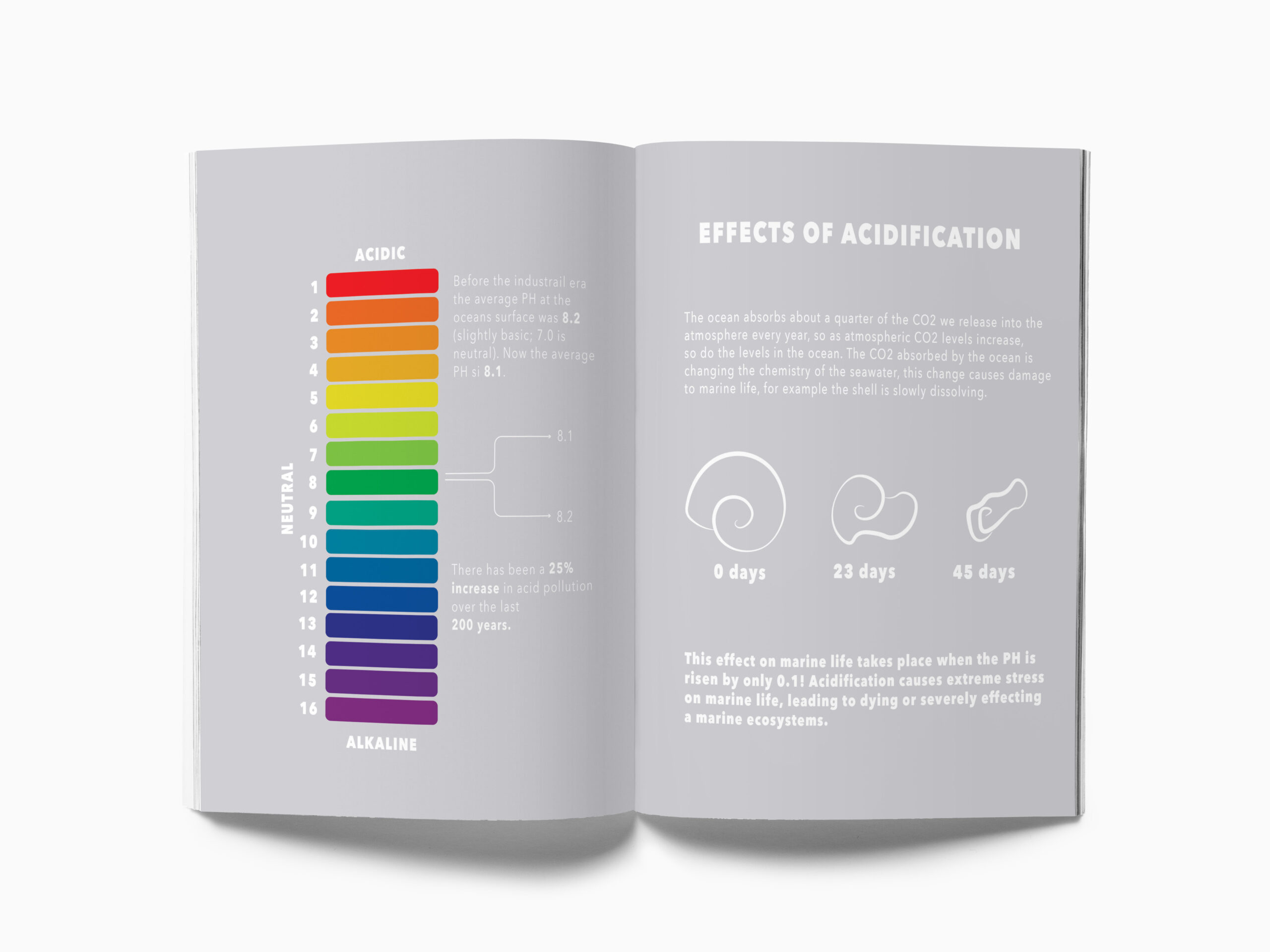
As this project was a information design module, I wanted to create a booklet that included a range of diagrams. I attempted to create unique diagrams that were more interesting that your standard pie or line charts. With photography and illustrations I created designs that depict the subject clearly in the hope of creating a easily read and fun piece of information.
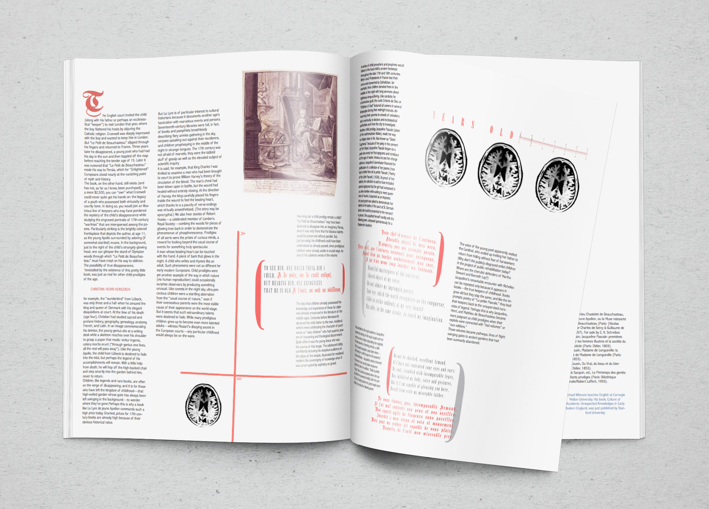
History Magazine
‘Athenaeum is used in the names of libraries or institutions for literary or scientific study.’
For this university project I developed a fictional magazine that fitted the article given in the brief. Running through out the editorial I created imagery that has an abstract feel but consists of brain scans. I was playing around with the idea of how you could visually represent intelligence.

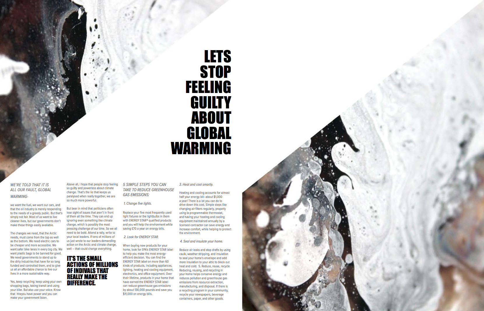
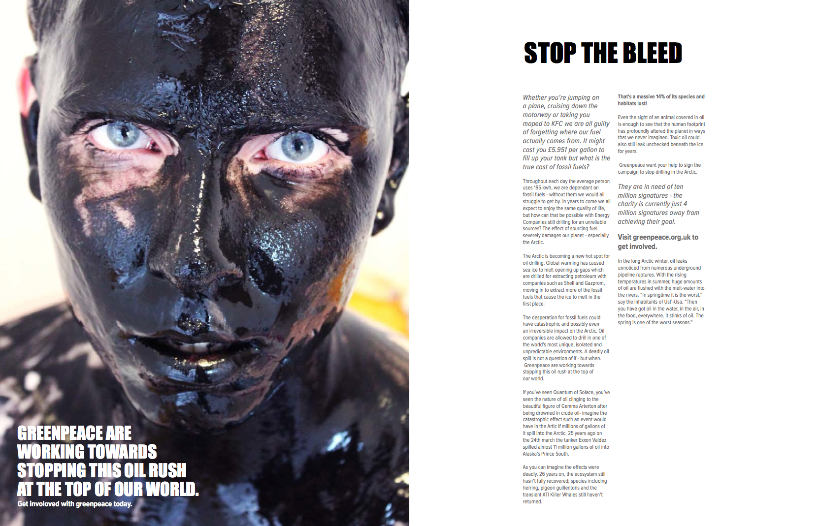
Ourtic
Ourtic was also another fictional magazine I created for a university project, acting as a one off publication for Greenpeace. The magazine explores the effects that human activity is having on the Arctic.
The articles were written for the pupose of persuading the readers to support Greenpeace while also advising on how the reader could reduce their carbon footprint. This was a first year project at university where I spent most of my energy focused on creating my own photography. I wanted to create almost abstract like images that interpret oil spills in a unique way. The outcomes are striking and dynamic, with bold texture that compliment the serious nature of the article.
DO YOU NEED MY HELP?
Are you looking for a Graphic Designer to help your with a project? I would love to hear from you, please get in contact below.
DO YOU NEED MY HELP?
Are you looking for a Graphic Designer to help your with a project? I would love to hear from you, please get in contact below.